date. 2023 January - 2023 May
city. Boulder, Colorado
by. Alexander Chan
Software used: Figma
Summary
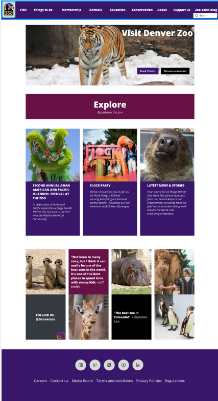
The Denver Zoo project had a poor preview of the site layout as it was disorganized, cluttered, and not user-friendly. The colors were not compliant with AA and AAA accessibility standards. This project was important because I was able to redesign the website to make it more organized and simpler for users to interact with, including the homepage, events, and ticketing. This renewed version aims to make it easier for users to explore the Denver Zoo website.
Challenge
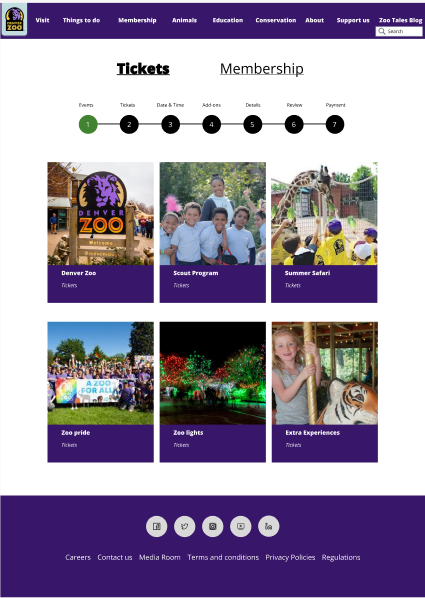
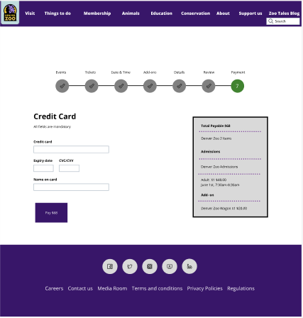
I encountered the problem of a lot of unimportant content listed on the website, and I had to decide what needed to be included and what did not. It was also a challenge to organize the content to be displayed on the homepage and events without too much clutter. Lastly, I had to brainstorm and come up with the best solution for the ticketing pages, as the purchasing process should be a few easy steps for the user.
Prototype
High Fidelity Wireframes

UX Evaluation
I conducted a redesign of the Denver Zoo website and used various UX research methods including card sorts, a Tree Test, and a site map. The identified problem was that the navigation bar for the original Denver website had confusing and unorganized content that did not make sense to be part of the website. The key findings were uncovered through the card sorts and a lot of user testing was conducted to understand how users would categorize different tabs for the page. Collecting user feedback on the redesigned website helped me understand how the majority of people perceived the content and provided useful feedback to make the website more user-friendly. Another important aspect was conducting a UX audit and identifying, one by one, the different areas of the website that needed changes.
Card Sort
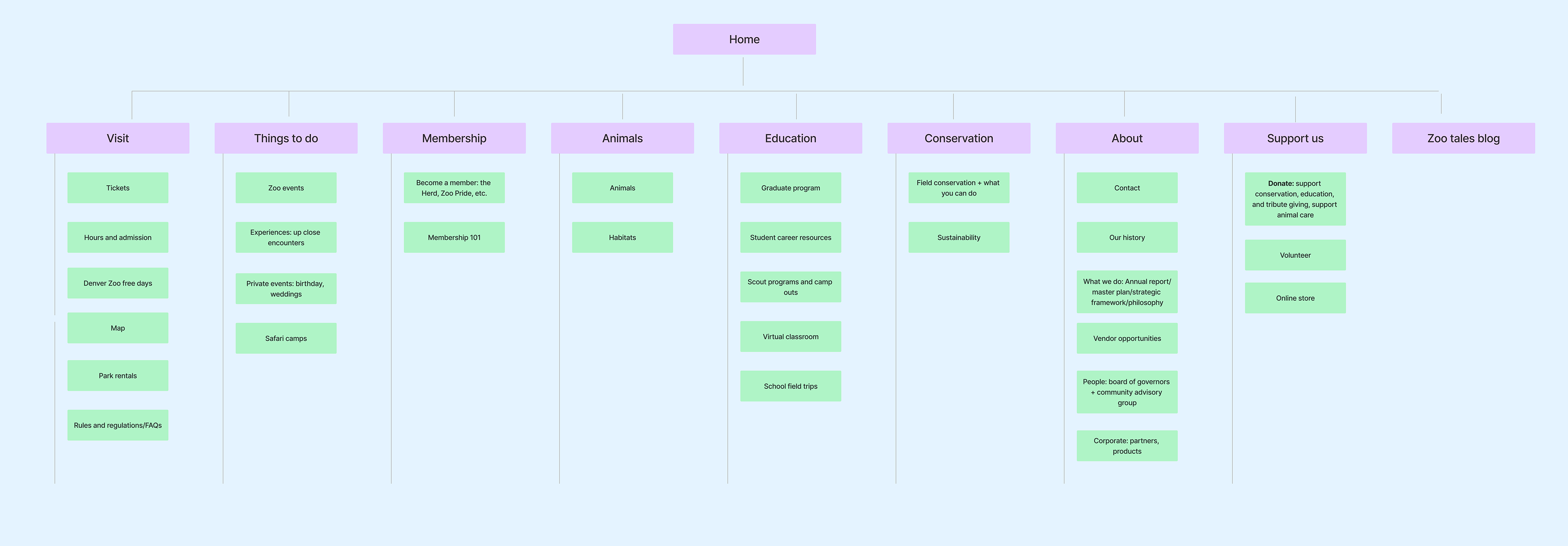
For the card sort, our class created eight tabs on the navigation that we thought would be valuable to the Denver Zoo website. These tabs were Visit, Things to Do, Membership, Animals, Education, Conservation, Support Us, and About. When conducting the card sort, users were asked to provide feedback on where all the secondary tabs of information would go for the user. This helped us understand what the majority of people thought and how the website navigation could be organized for a better user experience. The resulting design is an intuitive navigation structure that reflects how users think about the content.
Site map
This site map was created to help organize the primary tabs with the secondary tabs of information. These decisions were made within our UI/UX class to identify the most appropriate areas for users to easily find their information.
Tree Test
The Tree Test was conducted to understand how users interpret the navigation system. The test asked users to locate specific information, such as "tickets," by clicking on the tab where they believed the tickets would be located. This provided critical feedback about how people use the existing navigation system, such as the site map above. The actions and choices made by users were recorded and analyzed to identify any issues with the website's navigation structure.
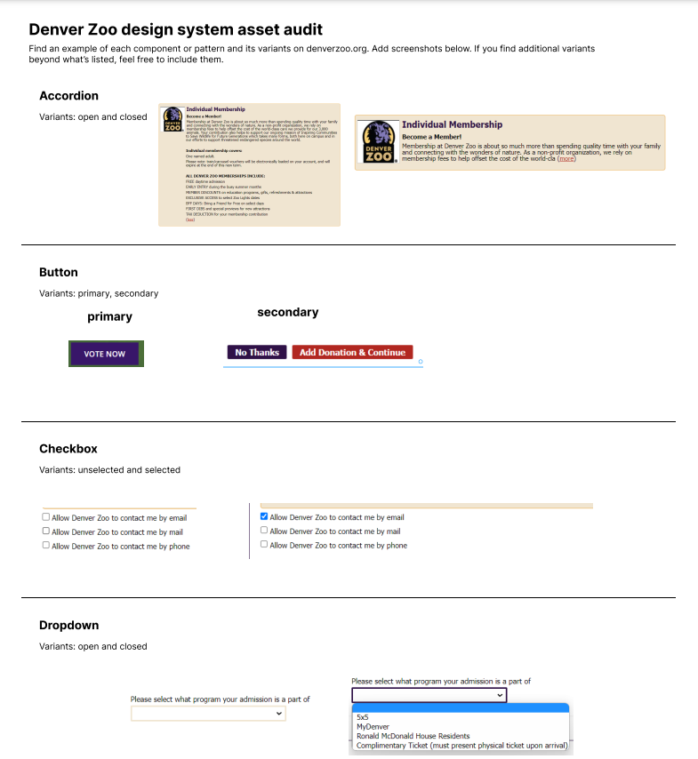
Design systems pattern audit
A design system pattern audit is a process of reviewing and analyzing the user interface, specifically by identifying the components and design patterns used in the design system. This helps to identify gaps, inconsistencies, and areas that could be improved.
Feedback
Professor:
- Do not need purple lines
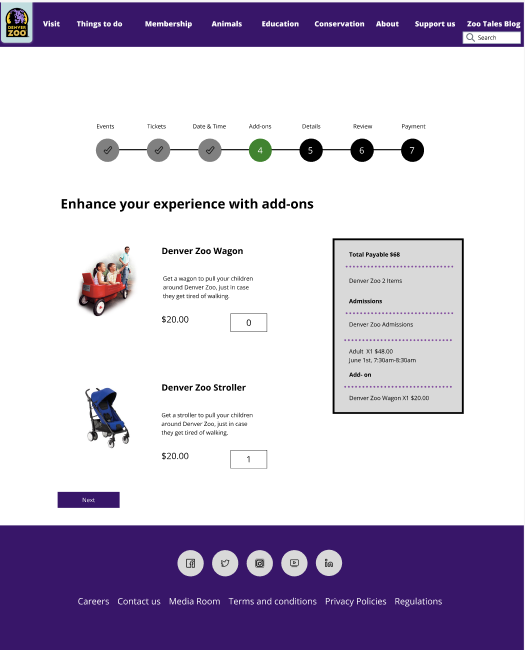
- Image for addons not important
- no box for Events & Explore
- maybe no need for card with images for main ticketing page
- Add default state for screens that had input fields.
- Change the color of the button on page to be different
- Do a contrast test for the colors and text
- Less context for card with information
- Add a new event to the main page so it is different than the event page
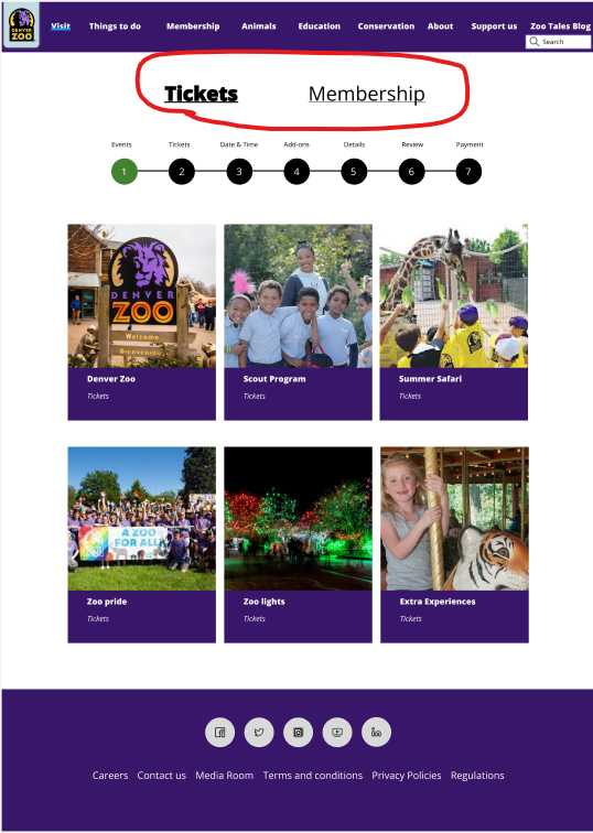
- Make the Tickets page have the "Tickets" underlined
- Remove + and - for ticket quantity and addons
- Add a check mark to the progression steps
- Change colors for the progression steps
- Add a line between the progression steps
- Move the next button to the bottom left
- Remove heading above the progression steps
- Change headings below the progression steps to H1
- Change color of buttons to fit the AA and AAA standards
Peer:
- Make sure to change spelling errors and capitalize
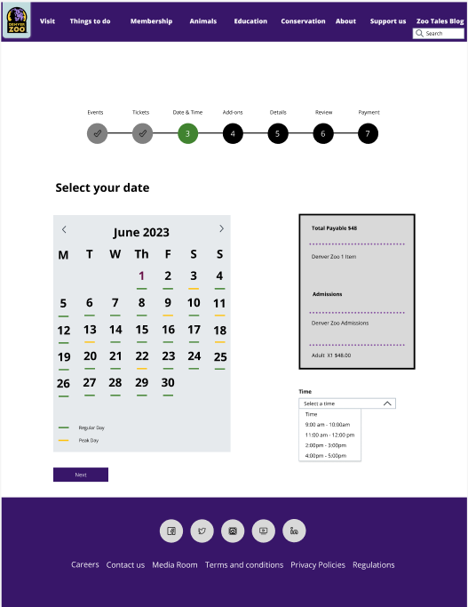
- Enjoyed to see peak days and regular days
- Do not need purple lines
- Image for addons not important
- no box for Events & Explore
- maybe no need for card with images for main ticketing page
- Add default state for screens that had input fields.
- Change the color of the button on page to be different
- Do a contrast test for the colors and text
- Less context for card with information
- Add a new event to the main page so it is different than the event page
- Make the Tickets page have the "Tickets" underlined
- Remove + and - for ticket quantity and addons
- Add a check mark to the progression steps
- Change colors for the progression steps
- Add a line between the progression steps
- Move the next button to the bottom left
- Remove heading above the progression steps
- Change headings below the progression steps to H1
- Change color of buttons to fit the AA and AAA standards
Peer:
- Make sure to change spelling errors and capitalize
- Enjoyed to see peak days and regular days
Evaluations
User testing process and pain points
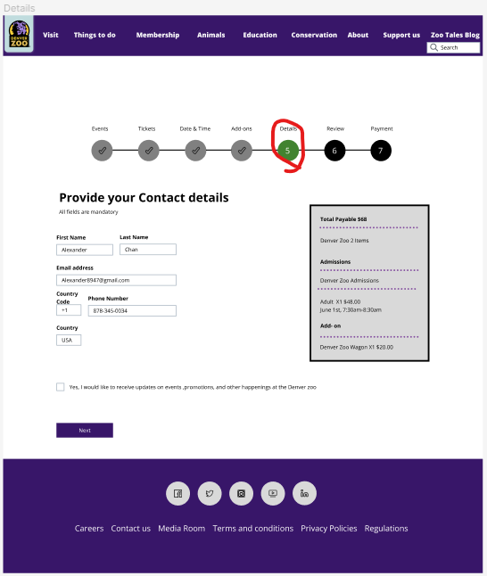
Through my testing process, I asked users what they anticipated a page would look like before picking them. Most of the user easily understood what would happen next. The only page people were not expecting was the "details" for the progression step as it might of been a bit unclear. This page was just asking about the details of the person.
Additionally, there was confusion with the toggle of tickets and membership for the ticketing page. Another thing is the user wanted there to be more content of the zoo. However, everything else with feedback was pretty smooth.
Additionally, there was confusion with the toggle of tickets and membership for the ticketing page. Another thing is the user wanted there to be more content of the zoo. However, everything else with feedback was pretty smooth.
Changes from user feedback/Proposed solutions
I will probably put the details page after the review next time to fix this misunderstanding or keep it the same.
I changed the tickets to have a underline and a bolder font when highlighted.
Professor:
- Add default state for screens that had input fields.
- Change the color of the button on page to be different
- Do a contrast test for the colors and text
- Less context for card with information
- Add a new event to the main page so it is different than the event page
- Make the Tickets page have the "Tickets" underlined
- Remove + and - for ticket quantity and addons
- Add a check mark to the progression steps
- Change colors for the progression steps
- Add a line between the progression steps
- Move the next button to the bottom left
- Remove heading above the progression steps
- Change headings below the progression steps to H1
- Change color of buttons to fit the AA and AAA standards
Peer:
- Make sure to change spelling errors and capitalize
- Add more information about the zoo and add more pages
Conclusion
I learned that to make a design better, it takes many steps to fully process your ideas into something that is effective and refined. I found a lot of inspiration from interviews and peoples way of thinking. The tree test really helped me understand how user think and I found it as a tool I use again in the future. I also was able to create a mockup and get feedback for certain designs to make it look more appealing and organized. A big key take away was to do as many different types of testing, such as interviews, tree test, card sorts, site maps and to have a better design for a majority of people to use. Experiencing these different types of testing getting peoples different perspectives help me make better designs.
Future Plans
If I had more time, I would of made these designs more refined. I would of love to use Adobe XD or photoshop to construct some better imagery. I would also like to add more screens, features and functions to this application. I plan to use tree test, site maps and card sort for better user experience in the future. I would also love to reach out to more people to get them to test the prototype and get feedback.